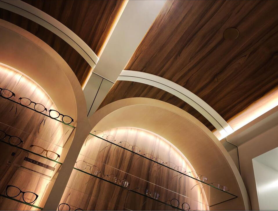
Hong Kong Optometric Services is a small business providing services of professional eyesight examination and eyeglasses prescription. The shop owner, also an optometrist himself, intends to create a boutique of optometric services that can provide a welcoming and professional vibe to his customers, rather than the usual chain stores that otherwise deliver the image of quick promotion sales.
The boutique is situated in a pretty small unit (31 sqm) on the upper floor of a commercial building in Central, Hong Kong. The existing condition of the vacant unit is not very ideal in that the headroom is very low (2.7m), and the exposed service pipes, sprinklers, and fan coil unit cannot be removed or altered. The exposed columns and beams also contribute to the awkwardness of the interior space.
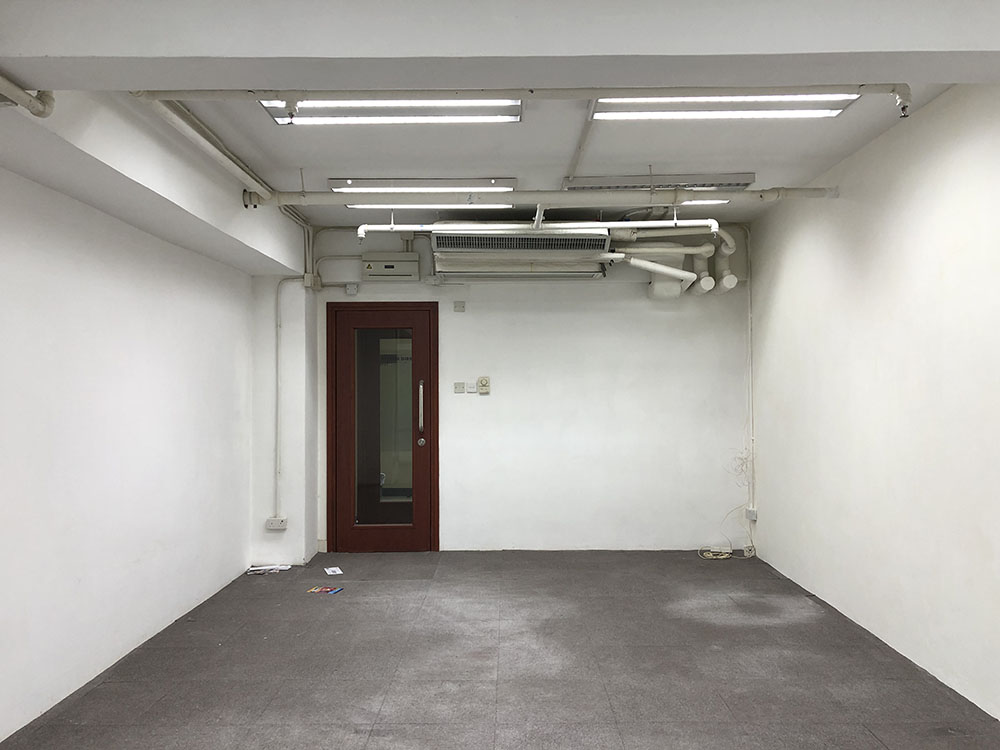
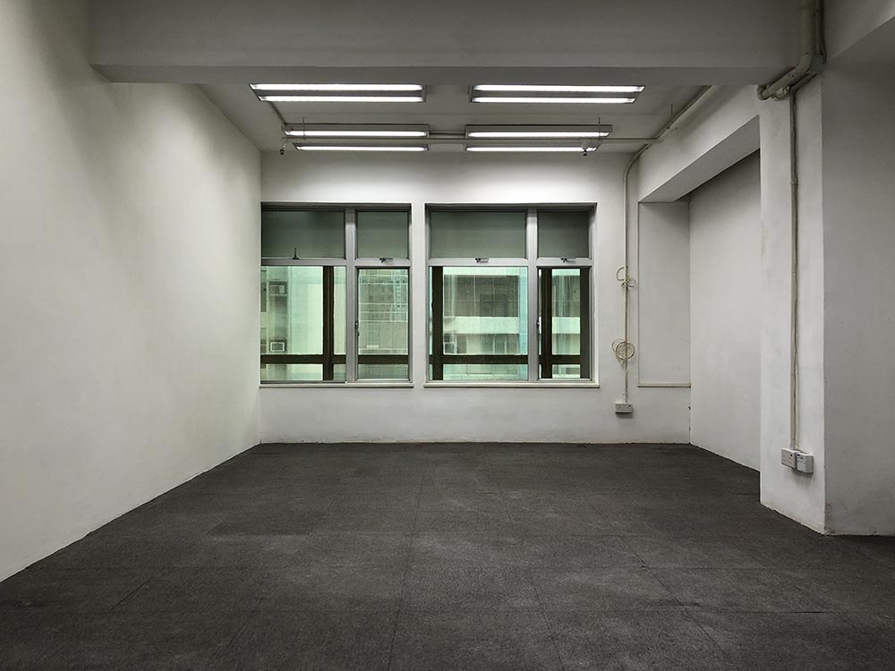
The challenge of design for this small shop lies in overcoming the unwanted elements, creating an interior that has its own voice over the austere concrete shell, and allowing ample display and storage spaces. Other practical considerations from the shop owner include visual classification of display according to different brands or styles of frames, a help desk for the shopkeeper in assisting the customers, a separate eye examination room, and a private work station for the owner himself
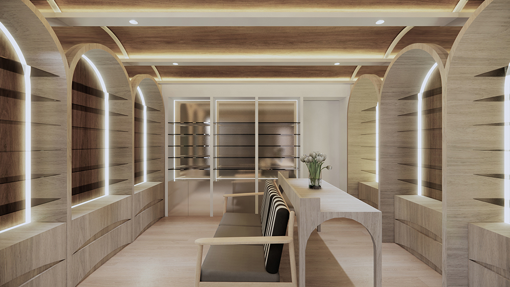
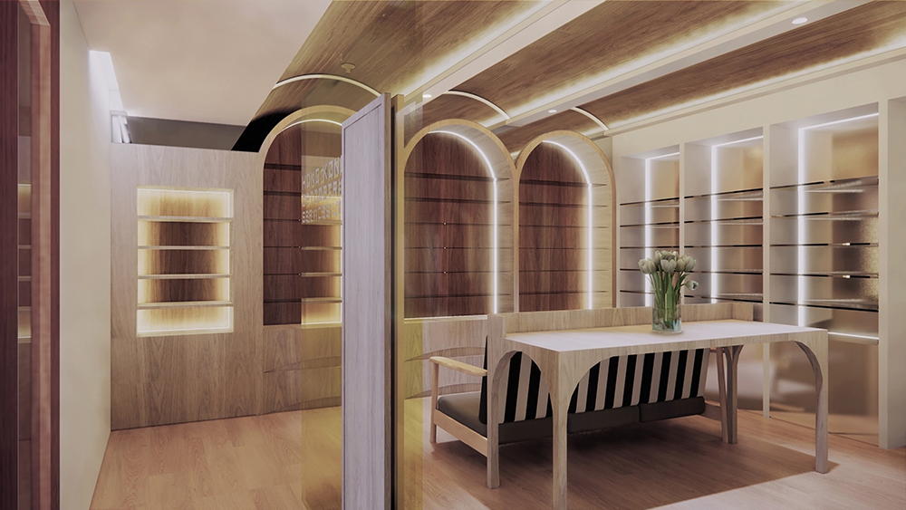
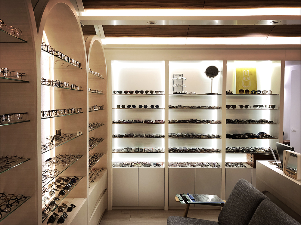
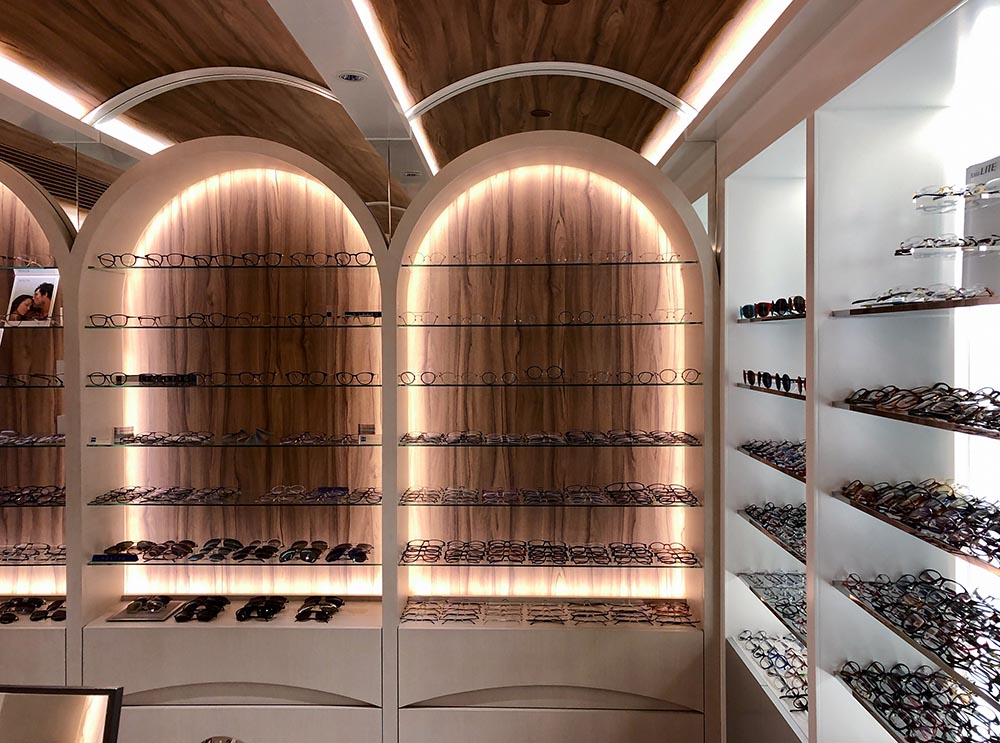
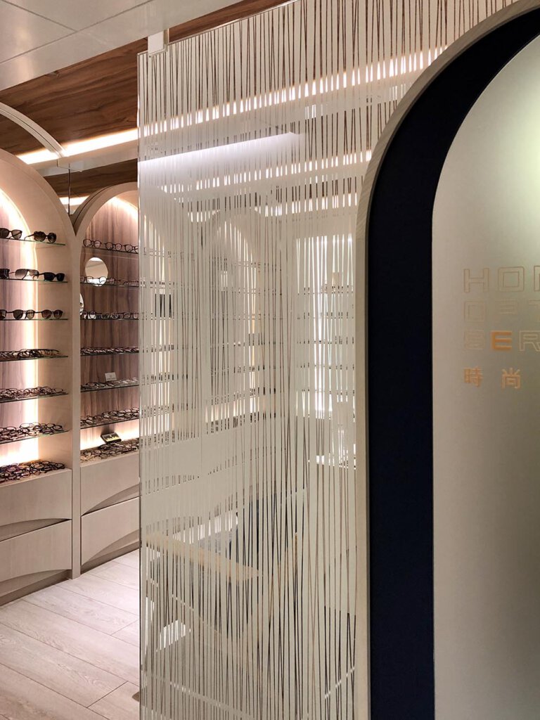
A flat ceiling to cover up all the existing services is already excluded at the very beginning, as this gesture will further lower the net ceiling height. The concept begins with a random sketch of connected curve lines for localized cover-up of the service pipes, which then slowly evolves into a series of vaults so that a higher ceiling can be achieved at their tipping points. The notion of vault is developed downwards to form several bays of arches which then become the categorized display shelves at eye level and drawers for storage at the bottom.
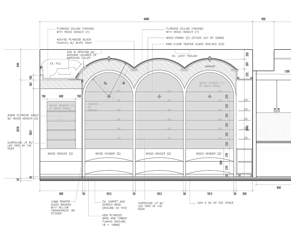
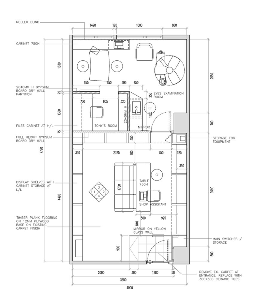
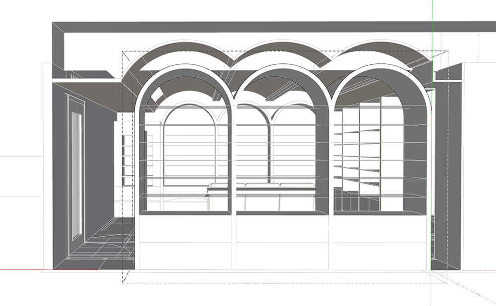
A little trick is played at the two upper sides where the vaults touch the wall – ribbon shape mirrors are installed to create an illusion of infinite extension of the ceiling vaults beyond the two side walls, and hence visually expand the space by erasing the concrete shell boundary. As to the materials, walnut veneer carrying some warmth is used in contrast with the stainless steel’s coldness. Concealed lighting tapes and indirect light towards the ceiling are carefully planned to reduce glare and unwanted reflections, so as to let the customers pick the frames comfortably.
 Swimming Pool Revamp, Pui Kiu College (2019)