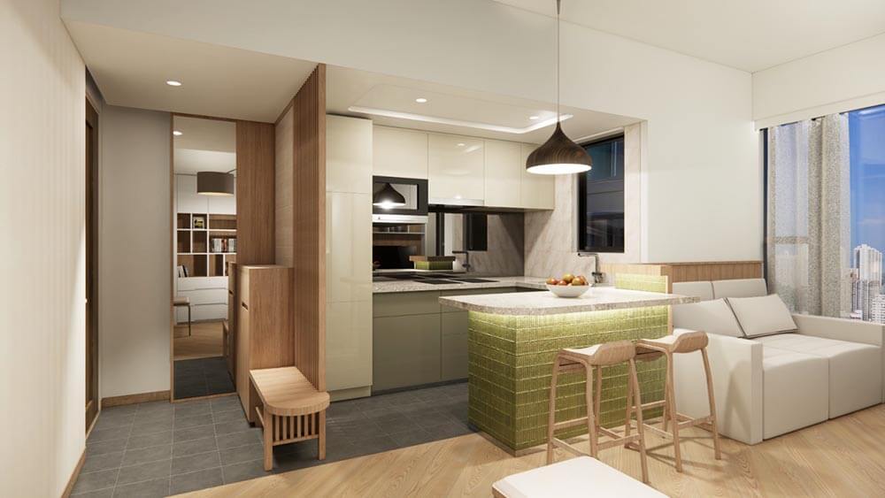
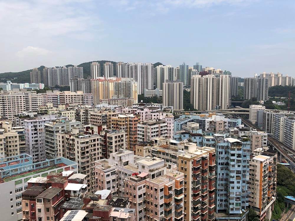
Grand Central is a big scale residential redevelopment in Kwun Tong, one of the most crowded districts in Hong Kong. The estate provides approximately 2000 units ranging from one-bedroom to four-bedroom sizes. This small interior design project is about remodeling the interior spaces for a couple who see this apartment as a permanent home after retirement some years later. The apartment is a two-bedroom unit of area around 500 sq ft with windows facing south-west overlooking a view of the neighbor residential buildings and the silhouette of a distant mountain.
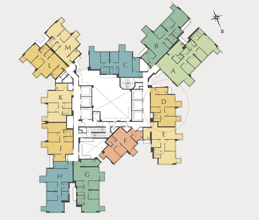
The couple are good friends with me for more than 20 years, and frankly say to me that they want me to design their “retirement home”. The existing apartment is a typical rigid layout with a fixed kitchen, living room, bathroom, and two bedrooms.
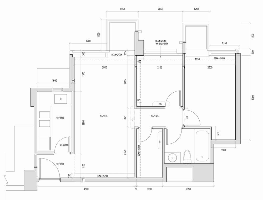
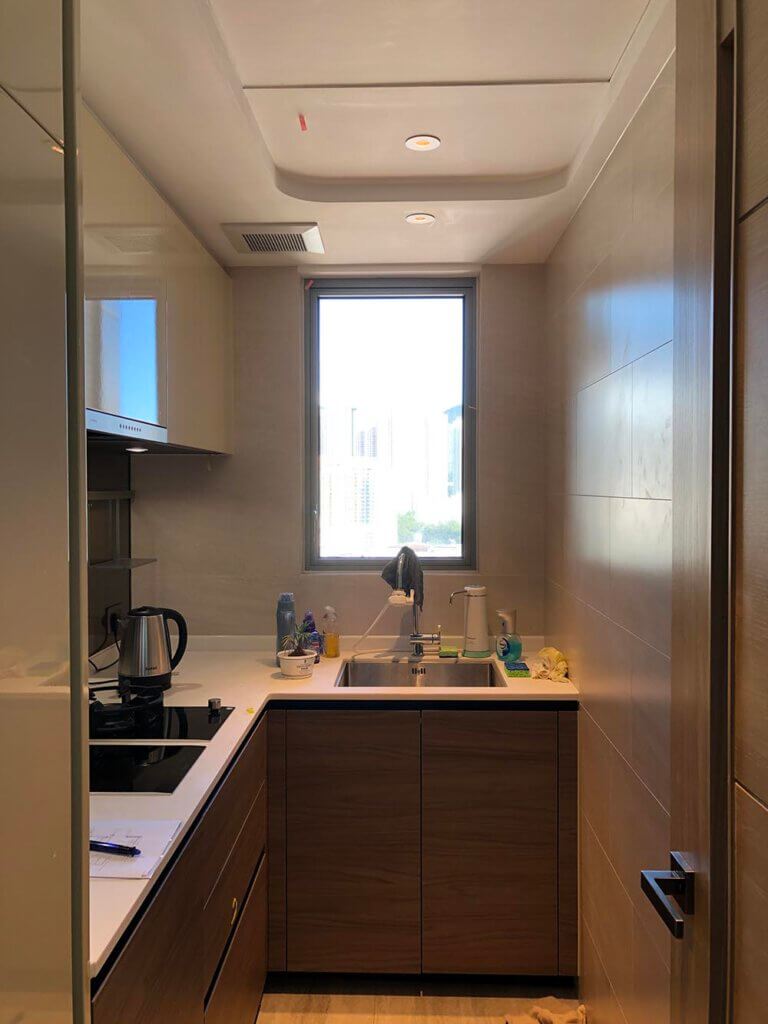
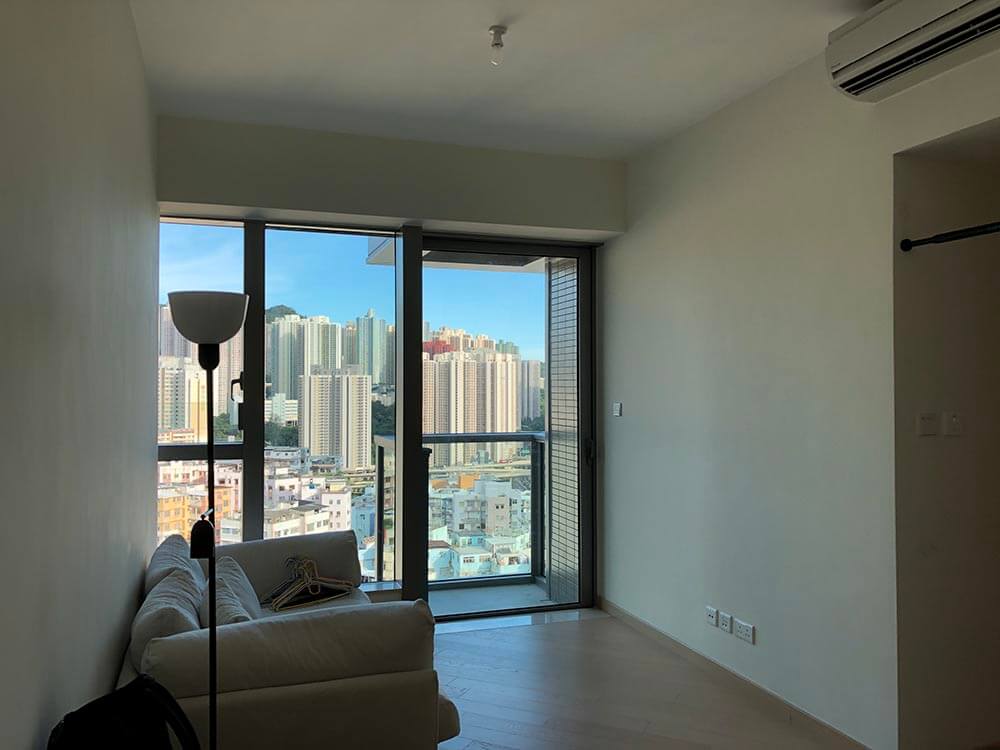
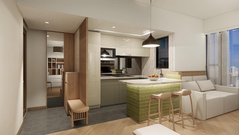
They wish to have an open kitchen not only to expand the airy feeling of the apartment but also to enable them to see each other over the day. Flexibility to adapt changes and efficient storage spaces are their also main concerns. The needs for a change in spatial provision include a decent area for yoga and home exercise, an occasional playroom for their grandchild, and a guest bedroom for their son during his summer vacation when he may come back from his college overseas. As to the style, they love simply decent but not the absolute minimal that may sound too numbing to live with every day.
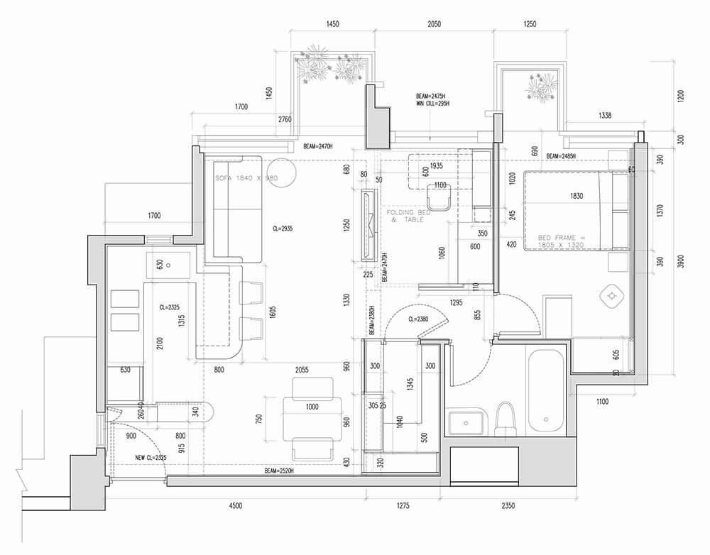
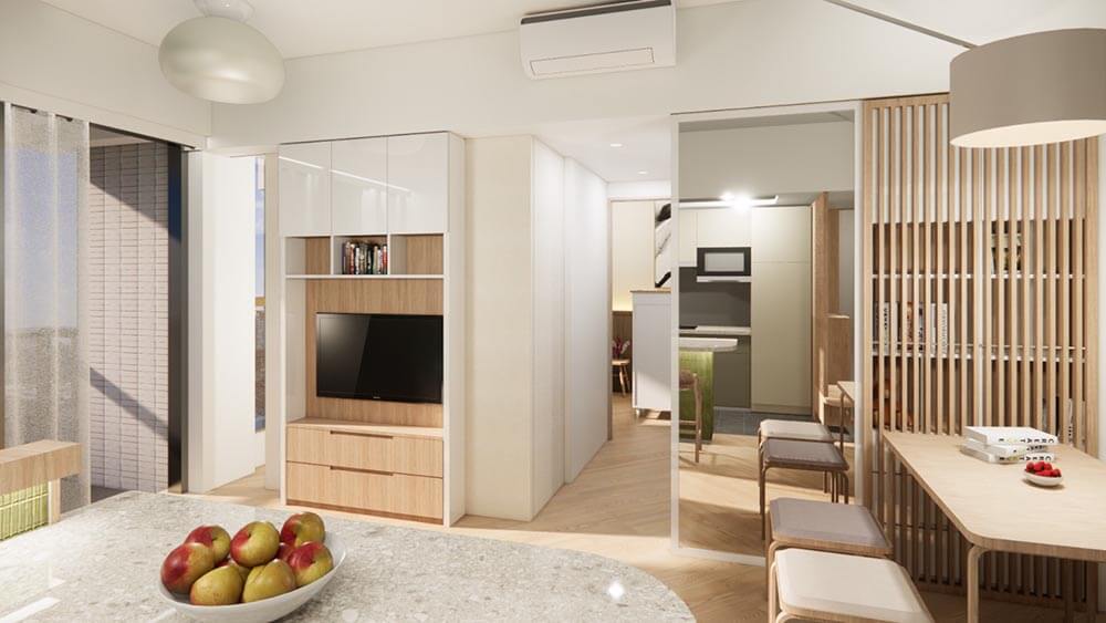
The design considers all the wishes of the couple, and starts with the sightline from the entrance. Previously, the first element one sees upon entering are just the kitchen door and the solid wall that are not welcoming at all. Open up the kitchen with a bar table provides an opportunity to re-orient both the movements of the eyes and the body. An integrated design of shoe cabinet, bench for changing shoes, and the timber lattice screen altogether leads the eyes along a diagonal sightline towards the inner spaces. The original smaller bedroom is also made open at two corners so that it becomes an extension of the living room. The sightline continues from the entrance to the bar table, then towards the open corner of this multi-function room, and finally absorbs itself into the distant city view. As this room is not always in use by the grandchild or the son, the bulky furniture like the bed and the study table are designed as pop-up items. They can be folded up and concealed against the wall, and release the space for casual leisure such as reading or meditation. It can also be turned into a private room for the son when the sliding partitions with built-in sound absorption felt are pulled out to close the corners.
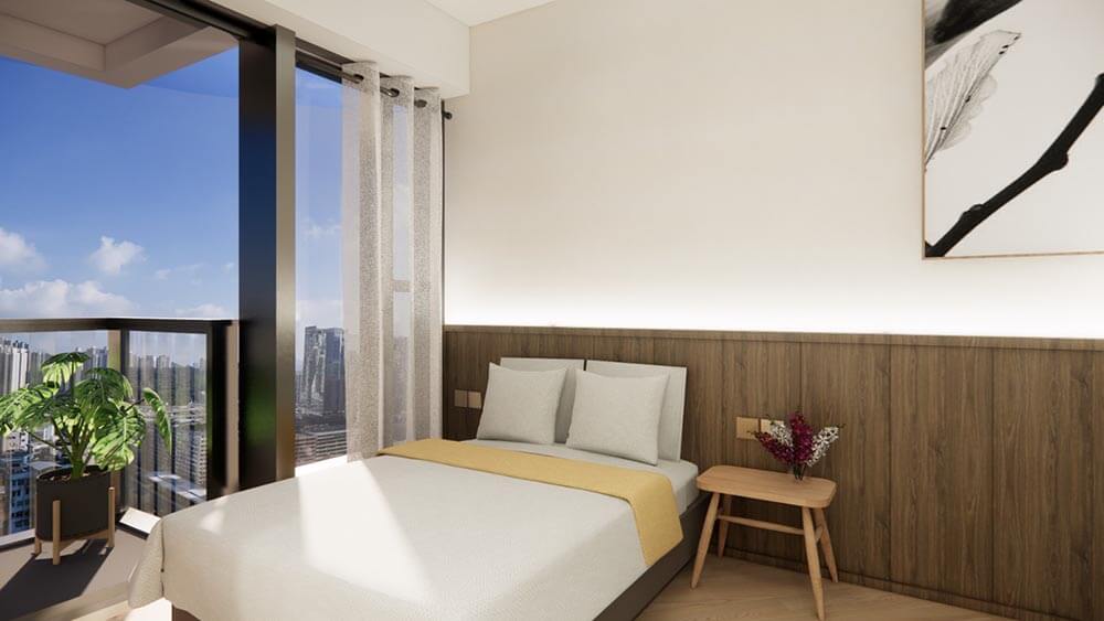
The storage cabinet in the living room has a subtly concealed mirror behind a sliding timber lattice screen. When the screen is in place, the subtle reflection by the mirror helps expand the space and, thanks to the vertical timber rods, visual disturbance caused by people’s movement in front of the mirror can be eliminated. The screen can be moved sideways to expose the mirror so that the wife can practice yoga at her wish. The store room arrangement behind this cabinet is tailored made to the requirements of the couple to ease classification and to keep all the spaces “in front of the scene” tidy. The master bedroom design is rather straight forward and simple. A continuous headboard in wood veneer is used on the wall so as to make the room visually wider, and echoes with the height of the dado wall behind the sofa in the living room. The overall atmosphere is depicted by using oak and walnut wood, and white paint as the background canvas, with the careful use of colourful ceramic tiles as the accent tones.
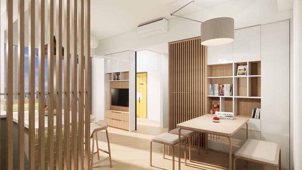
Many cities like Hong Kong are facing the burden of living in micro-apartment at a very high cost. A thoughtful re-modelling of spaces to suit the users’ needs is both a challenge and opportunity for the designer.
 Touch Ceramics and Gallery (2020)