
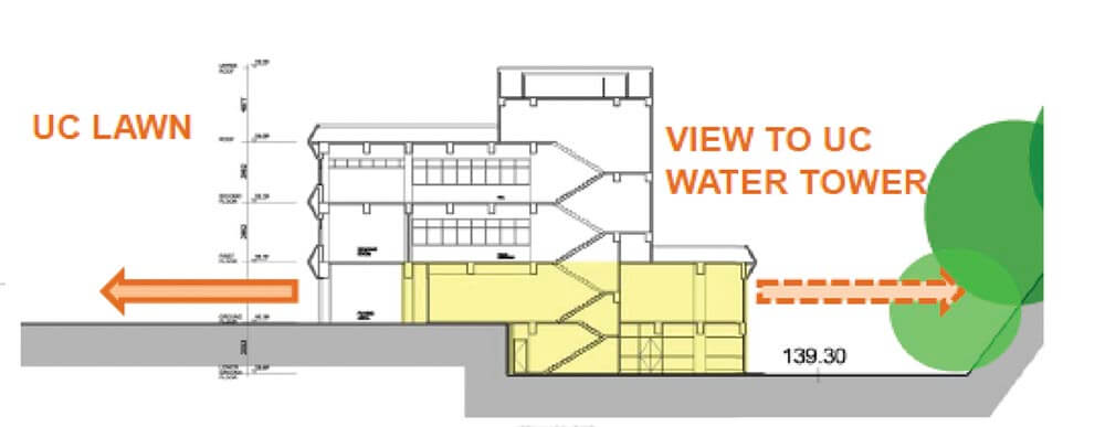
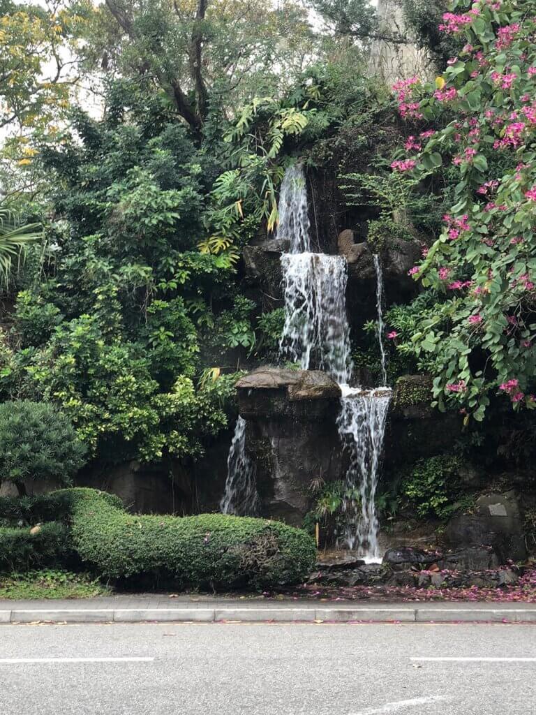
United College Wu Chung Library is one of the first generation of buildings in The Chinese University of Hong Kong. It was completed in 1969. The Library is a four-storey reinforced concrete building and its architectural language is an exemplifying representation of the late modernism and functionalism. The siting of the building is remarkable – to the west side main entrance is the greenery lawn which is a quiet place for students in the campus while to the east side lower entrance is a view towards the water tower and a landscape of a miniature waterfall. However, the visual connection between the indoor and outdoor is very poor.
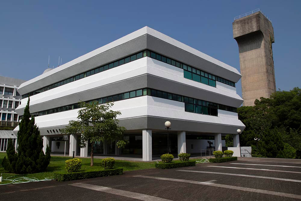
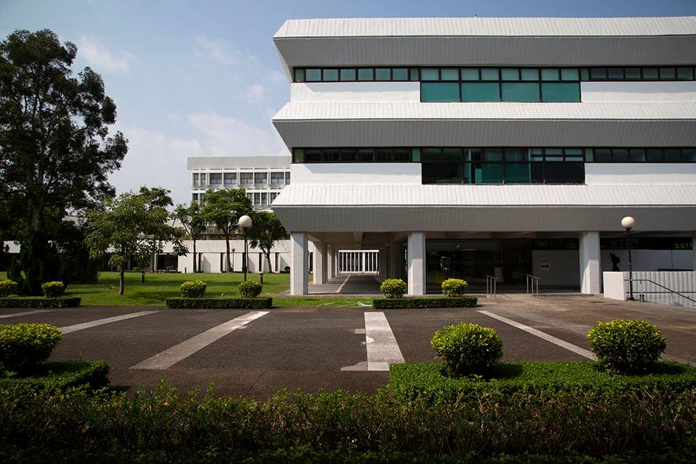
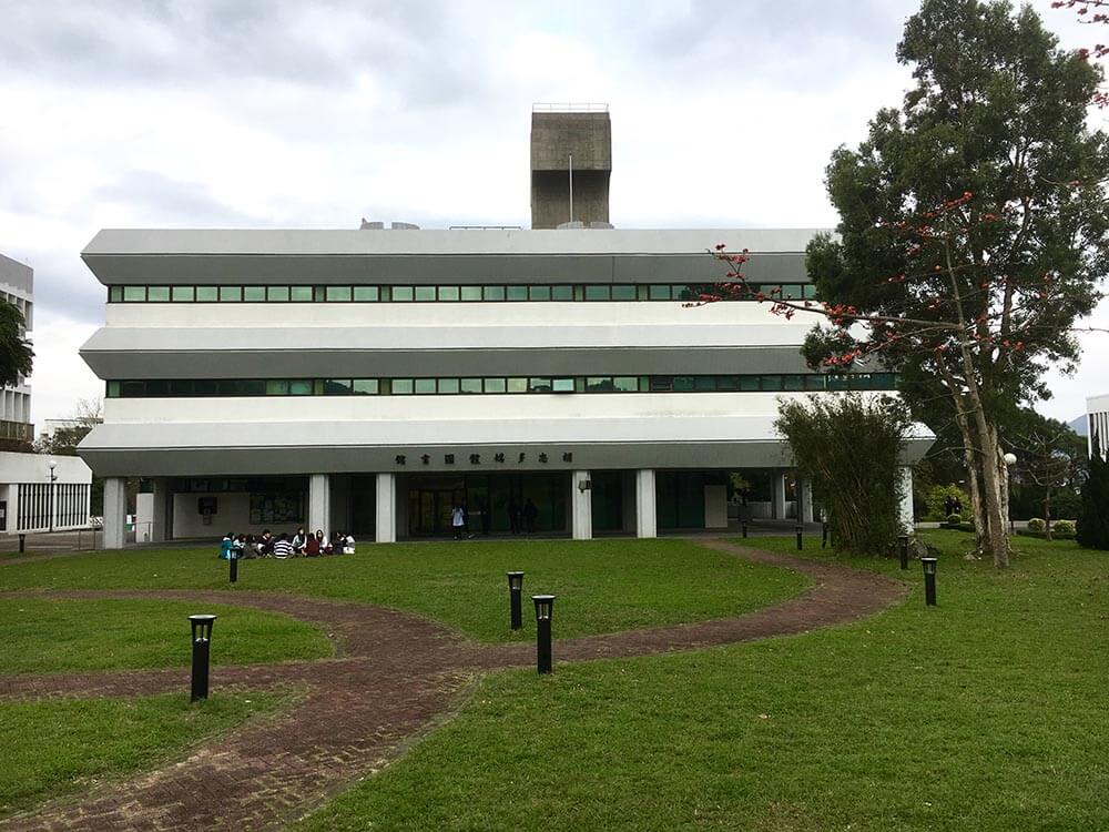
The majority of the ground floor has been tucked with bulk storage of DVD, help desk counter and associated back of house facilities which altogether make both the people’s visual and physical movements stagnant. The upper first and second floor are traditional library with regular rows of shelves for books of philosophy and open plan reading tables. The relationship between books, students and spaces has not been well articulated to provide the right atmosphere for reading.
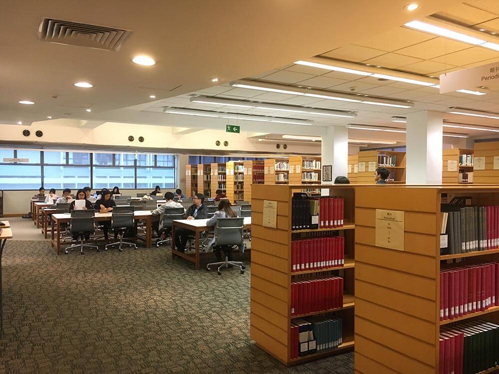
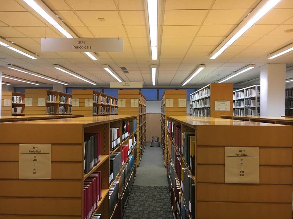
As the Library steps into her 50 years of age, it requires a thorough interior renovation so as to cope with the changes in e-learning, group studies, while maintaining the paper book reading that takes one to the contemplation of the philosophical spheres. The Library is going through significant changes as multimedia hard disks transform to video-streaming, and therefore the collection of DVDs on the ground floor becomes less and less relevant to the borrowers. The Library has a plan to create itself as a boutique humanity-based library on the upper campus by emphasizing the philosophy collection and taking care of the needs of students who are sophisticated users of e-learning and have high expectations of study spaces.
The design has taken into consideration of the inherent spatial characters of each floor with regard to the site setting and the interior spaces, and have come up with the following solutions that meet the users’ requirements:
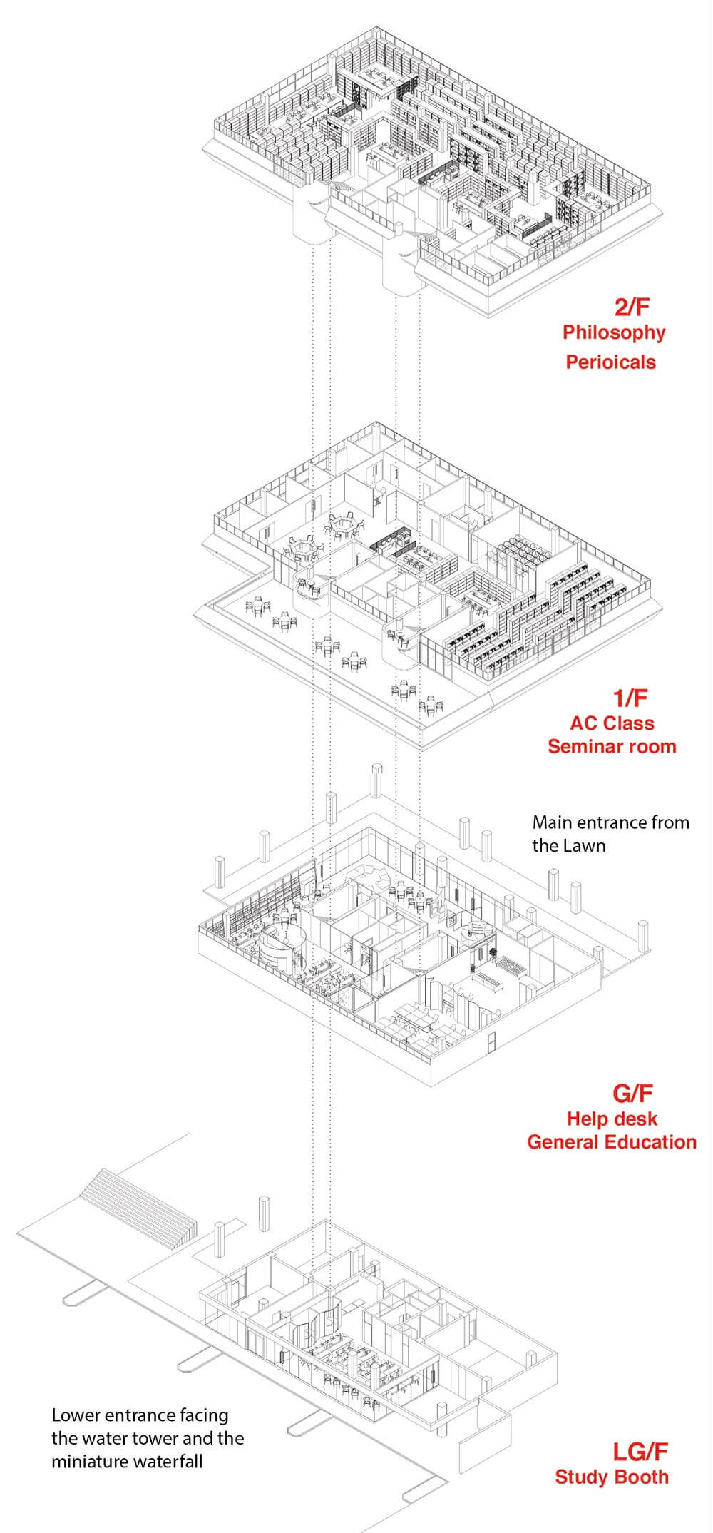
LG/F: The Library is constructed on a level difference and the lower ground floor has about half the area of the ground floor above. Though it is connected with one of the staircases from the upper floors, its physical setting makes it somehow isolated from the library functions. Therefore, it is assigned as a study room being 24 hours accessible to students. Instead of having the old-fashioned partitioned desks, we seek for varieties in the seating arrangements such as sofa and casual seats around coffee tables that provide a view towards the waterfall landscape; open long tables equipped with computers for e-learning; group study rooms that allows discussion among students; and lastly, the tables with adjustable heights to take care of the wheelchair users.
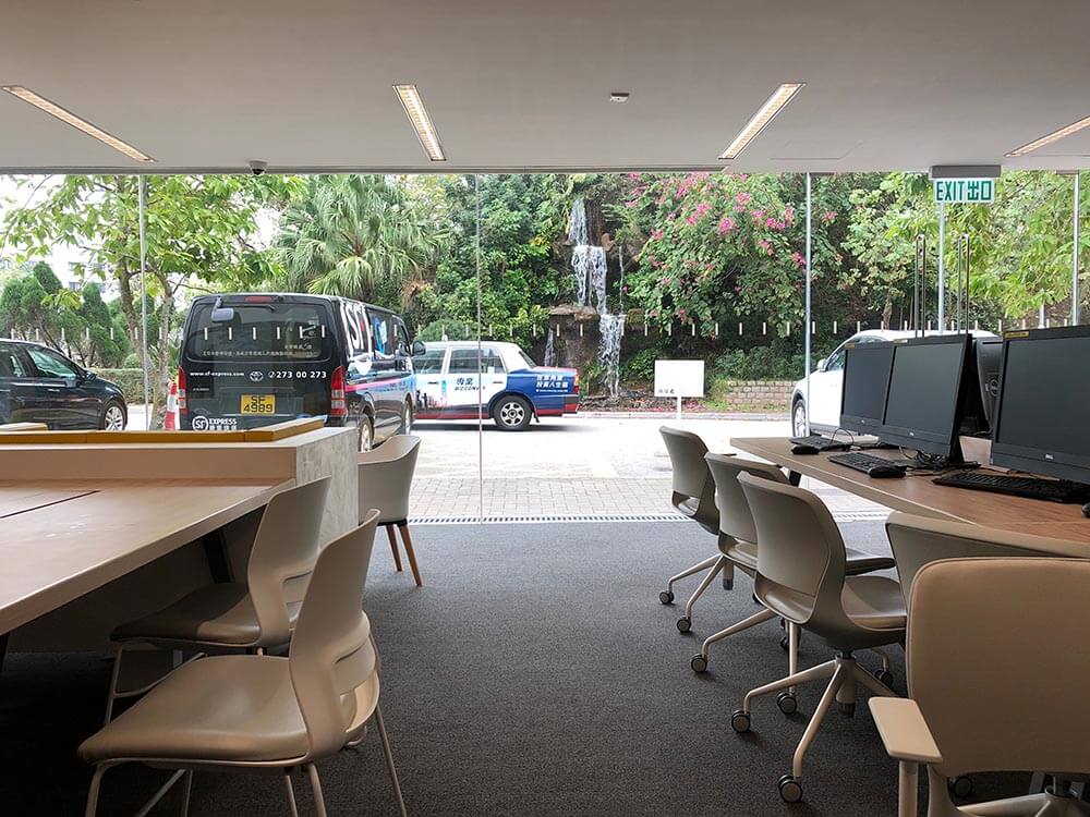
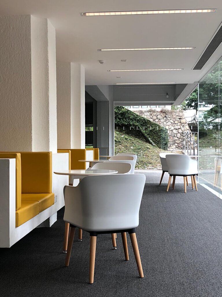
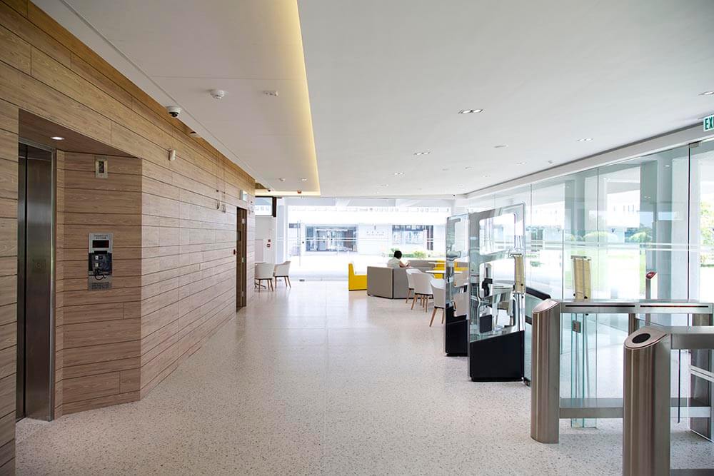
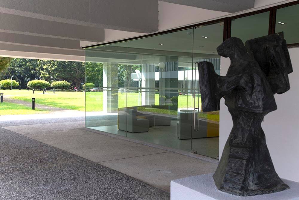
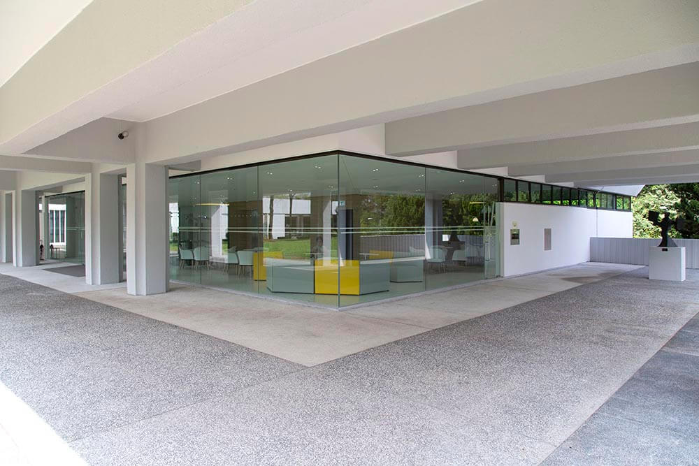
G/F: The main entry floor is an ideal place to start the library journey which fits for meet-ups, casual group discussion, and looking up for the latest book recommendations. The previous obstacles at ground floor plan are removed or streamlined so that a free movement around the core of vertical circulation is made possible. Various nodes such as study rooms and e-learning facilities are placed along the circulation to the convenience of students. Most importantly, the west façade and the south west corner are re-designed with frameless window wall to dissolve the boundary between indoor and outdoor. The landscape prepares the mood for one to go into the reading world.
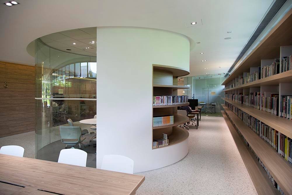
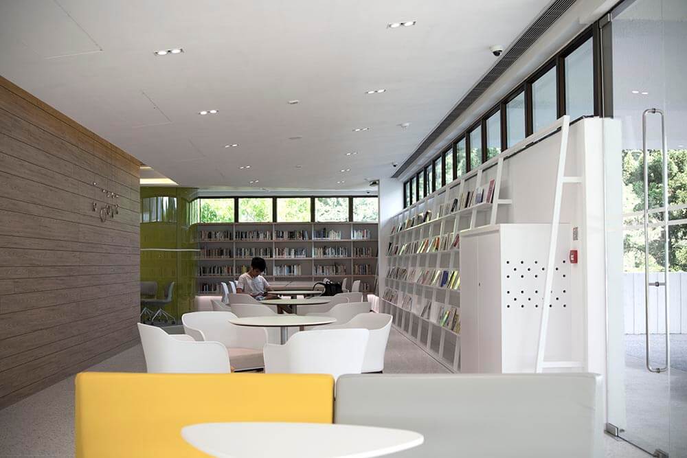
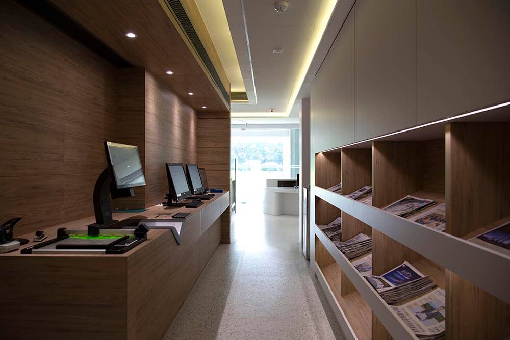
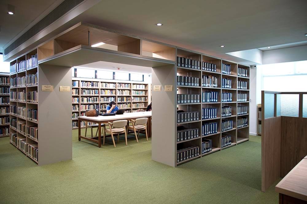
1/F and 2/F: On the upper floors the bookshelves are rearranged as clusters such that various interconnecting ‘reading rooms’ defined by the bookshelves are formulated. This is intended to depict a quiet atmosphere for oneself of being surrounded by knowledges and it is hoped that the atmosphere could take one to contemplate into the world of philosophy.
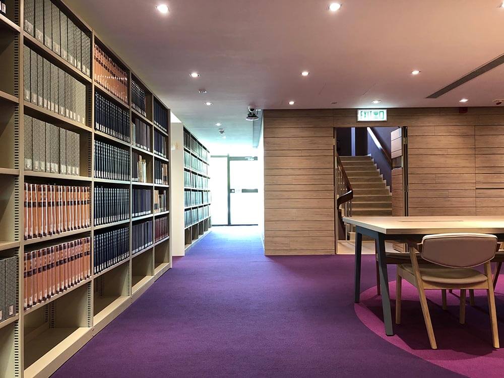
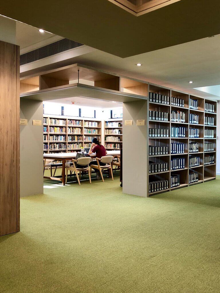
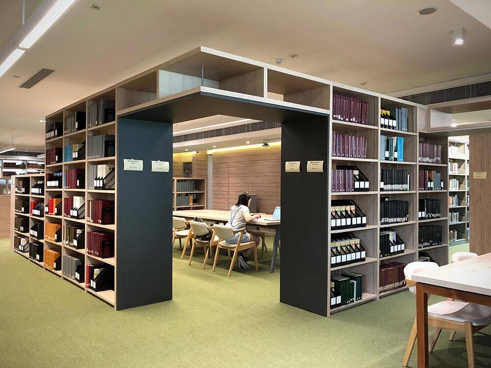
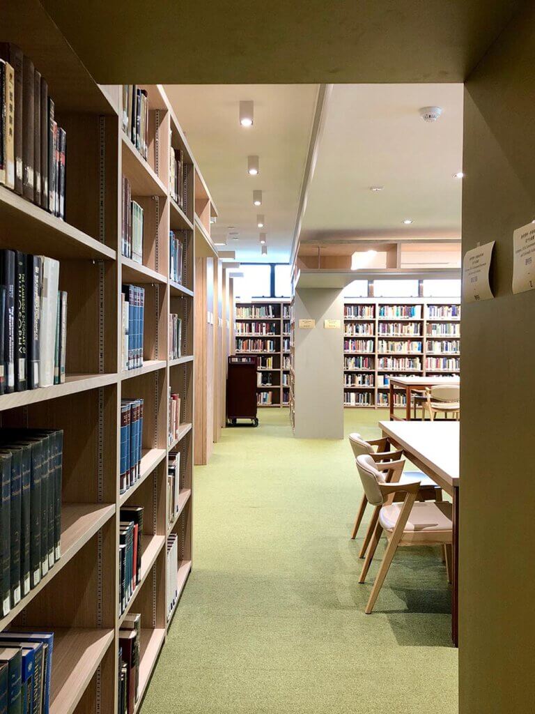
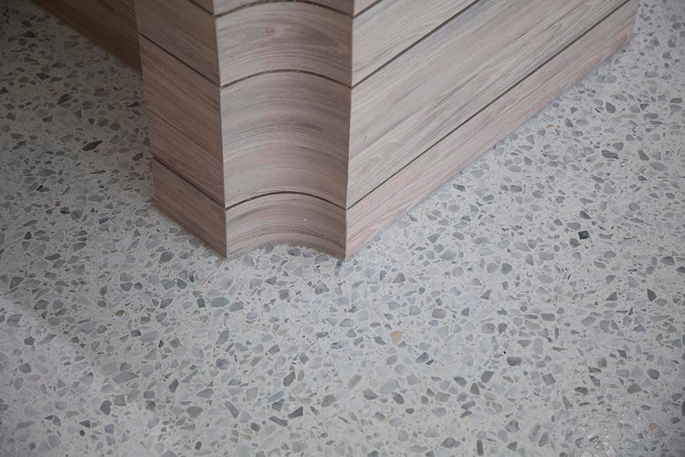
While respecting the modernist & functional architectural language of the Library, the new renovation attempts to bring in a contemporary touch to the interior. The materials of the existing building envelope include the off-form concrete, coarse texture paint, wash-grano and grasses. The proposed interior materials include terrazzo, fine texture paint, wood veneer and fabrics. Grey tones are adopted as the transitional spaces while accent colours define the staying areas, and the materials change from hard to soft.
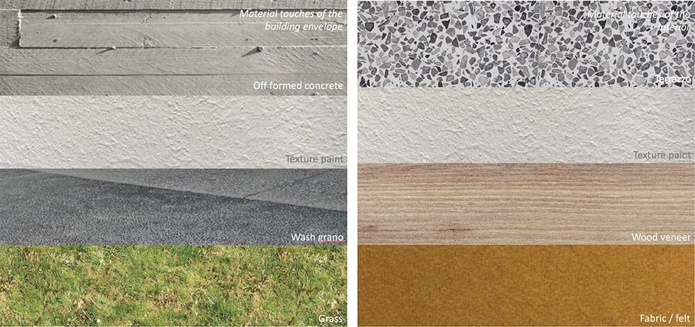
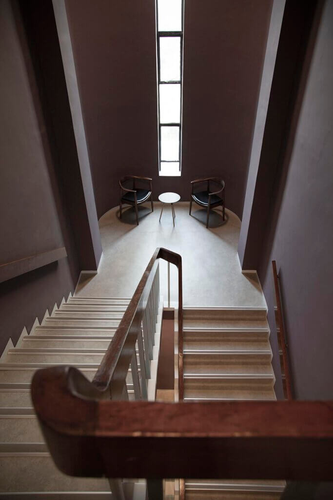
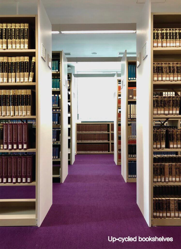
The library experience starts from the lawn in front of it. Along the route from outdoor to indoor, the floor materials change from grass to wash-grano under the verandah, and then change to light grey smooth terrazzo slabs upon entering. We took the advantage of the high ribbon windows and designed the ceiling as inclined planes to deflect the daylight to the interior. Majority of the walls are also white painted for a fresh and silent environment. The service core becomes the centre of gravity of the interior spaces. In order to give it some weight and warmth of feeling, ash wood textured plastic veneer is applied on the walls. The same core finishes and subtle groove lines continue to the cores of the upper floors for a consistent visual clue. When students arrive at the first and second floors, the spaces are carpeted with accent colours purple and green respectively, together with the rooms-of-books, so as to create an atmosphere that invites one to stay and read. The staircase does not just function as vertical circulation but also provides a medium for casual encounter and leisure reading. The floor is finished with light grey vinyl for a continuous tone from the ground floor. However, the walls are deliberately painted in dark greyish purple for a mystical experience.
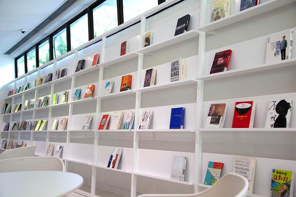
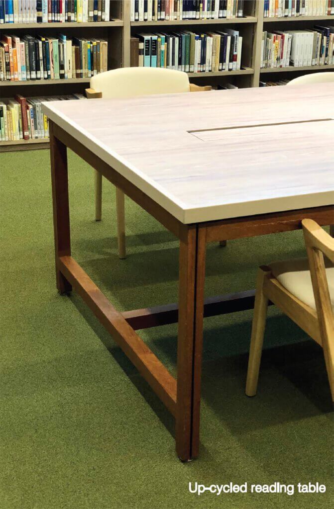
Besides providing computers for e-learning or archive searching, we have also installed CO2 detectors at waist level so that when the interior is crowded with students, the speed of air change would automatically increase to provide air comfort. The illuminating battens are equipped with motion sensor so that when certain rows of bookshelves are not visited for a long duration, the lights would go off to save energy. With due consideration of limited budget and reduction of waste, at least 50% of the bookshelves are re-used. Since the shelves are purchased in different years, there are about 3-4 different appearances and sizes. We modified them using newly made side and head panels to tidy up the elevation alignments. The old reading tables are up-cycled by replacing the table top with newly made plywood cladded with ash wood plastic veneer pre-installed with electric plugs, USB hubs and LAN ports to cope with modern day necessity.
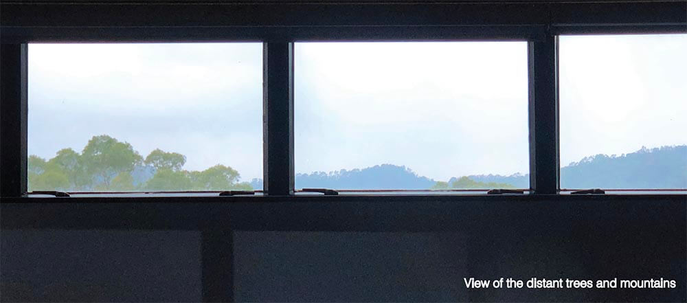
We treasure the varieties of landscape vistas and love exploring the relationship of “see and be seen”. We see the basic components of architecture – planes, columns, window as framing elements to capture the surrounding scenes. By the daytime when there is abundant daylight, the outdoor landscape flows into the building interior. At night when the outdoor is dark, the interior glows like a lantern and talks to outsiders.


As the construction period is only allowed in the summer vacation from May to Aug 2018, time is very tight. We have to work out a number of ways to streamline the renovation process. Long lead materials like terrazzo slabs, veneers, furniture were decided and ordered at the early stage. Standardize details of bookshelves and tables so that they can be fabricated in factory within a short period. Dry works construction is applied to majority of works to save time.
After the renovation works is completed, feedbacks from users reveal that they find the library more user friendly than before, the spaces are more comfortable than before, and most importantly is that, they enjoy learning, reading and meeting their schoolmates in this new place.
 Viva Blue House (2007-2017)